Making a great first impression in the digital space often begins with your website design. It isn’t just about pretty visuals or eye-catching colors; it’s about creating an online presence that works, tells your story, and drives results. However, even seasoned professionals can overlook details that quietly drive users away or undermine business goals.
If you’re aiming for a site that draws people in and makes them want to stay, understanding key aspects of website design and being aware of the usual pitfalls is crucial. Many errors, often linked to poor planning or execution, stem from overcomplicating things, ignoring usability, or simply forgetting the user’s needs. Fortunately, most of these mistakes have straightforward fixes.
Let’s look at ten frequent mistakes, why they matter, and practical steps to avoid them. With these tips, your site will be clearer, faster, and more convincing in no time.
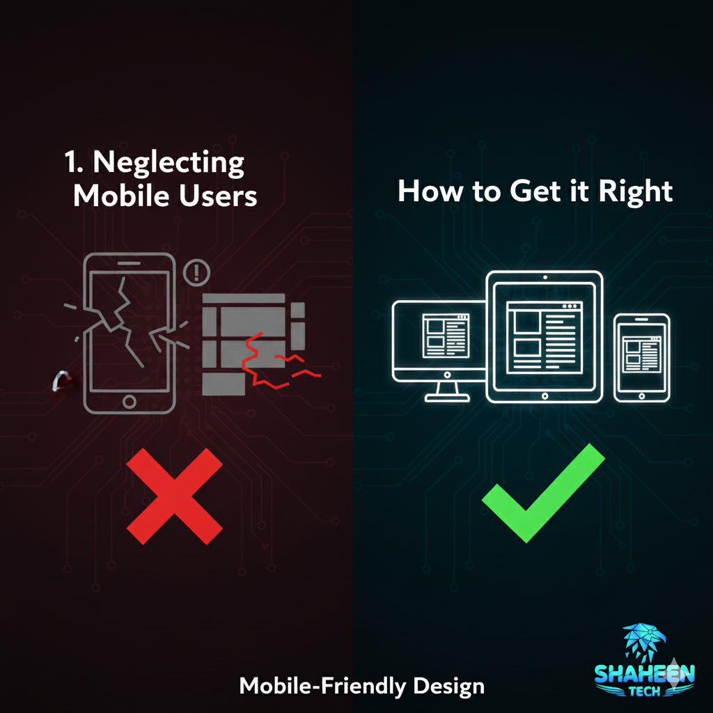
1. Neglecting Mobile Users
With most internet traffic coming from smartphones and tablets, mobile accessibility isn’t a bonus; it’s the baseline. If your site isn’t responsive or appears broken on smaller screens, users will quickly get frustrated. As a result, engagement and search rankings suffer.
How to get it right:
- Use fluid layouts that adapt to any screen.
- Test designs on devices of varying sizes.
- Avoid elements that are hard to touch or interact with on mobile.
When your site is mobile-friendly, you welcome more visitors and often see higher conversions. For expert help, consider professional website design services that specialize in responsive solutions.
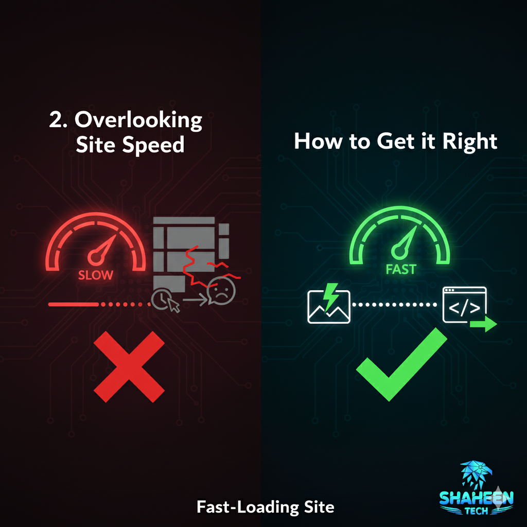
2. Overlooking Site Speed
A slow-loading site creates an invisible barrier between you and your audience. Studies show that users expect a page to load in under three seconds. If it takes longer, they’re likely to click away before even seeing your content.
You can speed up your site by:
- Compressing images without sacrificing quality.
- Using modern, efficient code.
- Minimizing third-party scripts and unnecessary plugins.
Additionally, investing in a solid hosting provider brings noticeable improvements. For more tips on improving site speed, check out Google’s PageSpeed Insights.
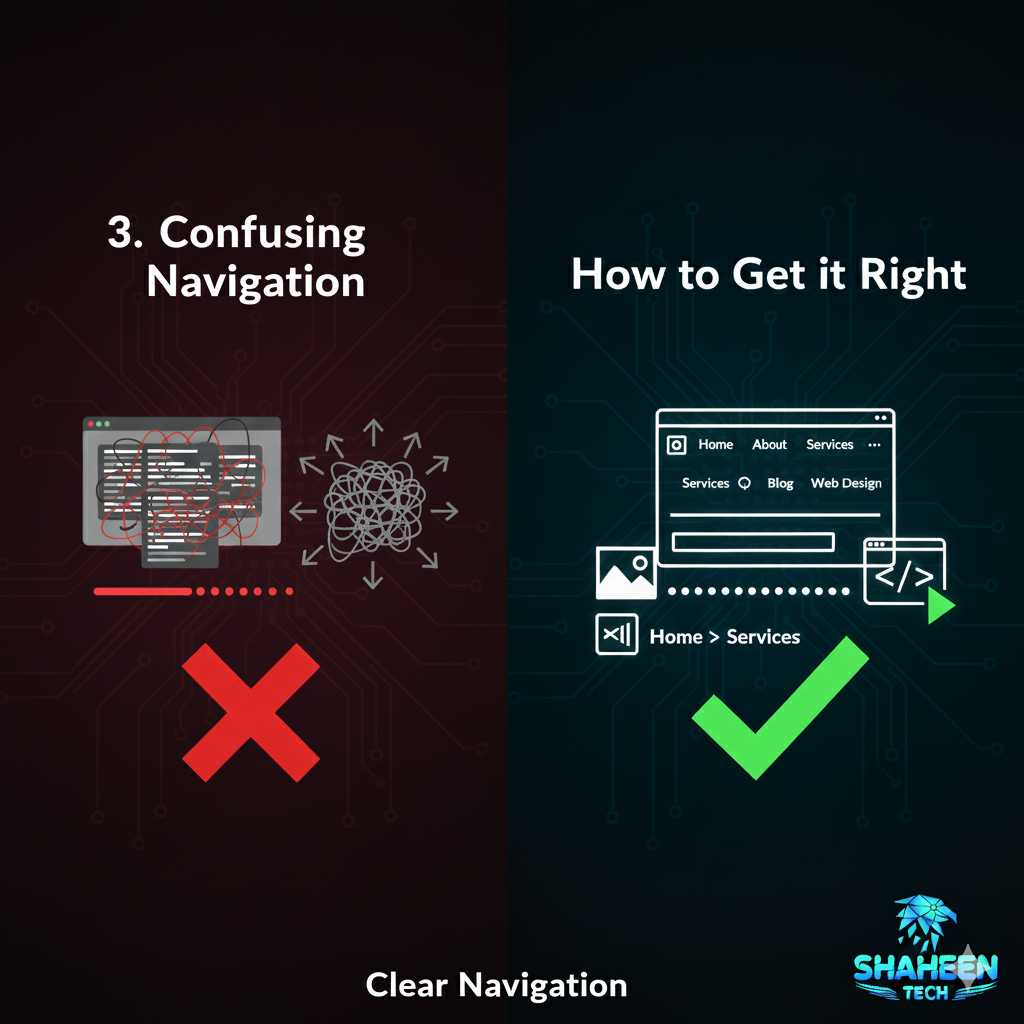
3. Confusing Navigation
Even the best content can get lost if users can’t find their way around. Confusing menus, hidden navigation elements, or too many choices overwhelm visitors and damage user experience.
To keep things straightforward and improve your website design:
- Limit main navigation items to 5-7 links.
- Use clear, descriptive labels.
- Incorporate breadcrumbs for complex sites.
Consistent navigation helps users move through your site naturally and encourages deeper interaction.
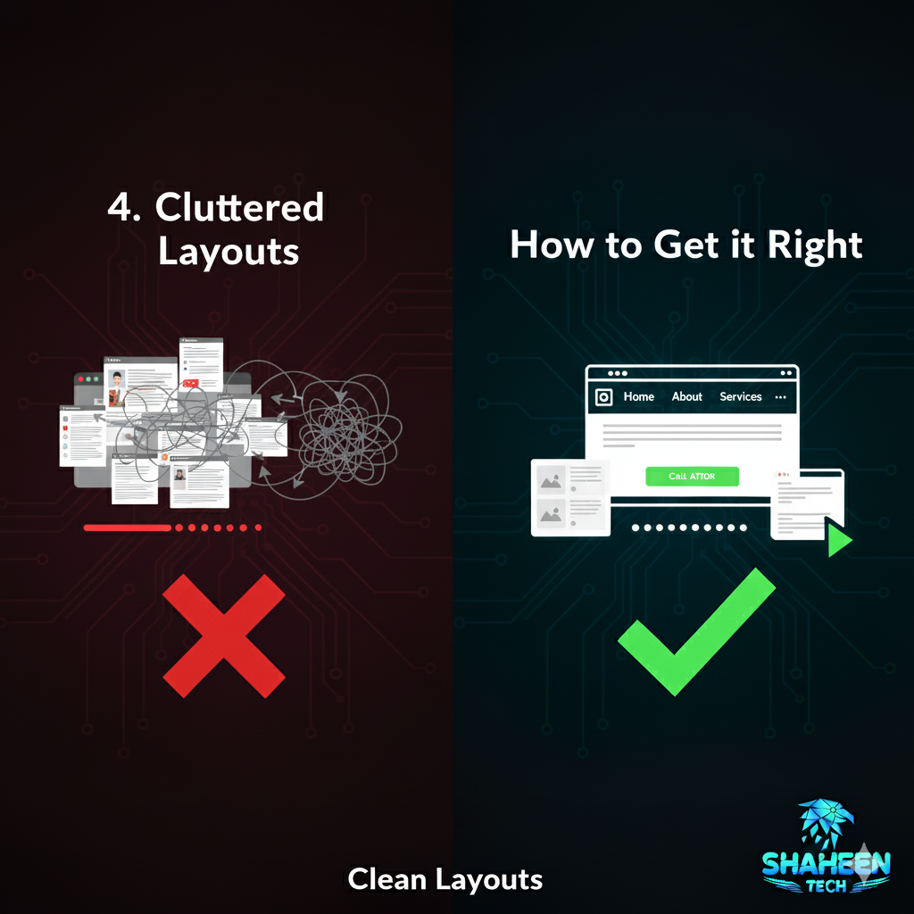
4. Cluttered Layouts
A busy, crowded layout in website design overwhelms the senses, disrupts the aesthetics, and dilutes your main message. If visitors struggle to figure out where to look, they’re less likely to understand your value or take action.
To simplify your site:
- Use generous white space to guide attention.
- Focus on one principal action per page.
- Organize content with headings, subheadings, and clear sections, using website design templates to maintain consistency and ease of understanding.
Simplicity and aesthetics are the foundation of a memorable and usable online presence, and effective website design plays a crucial role in achieving this.
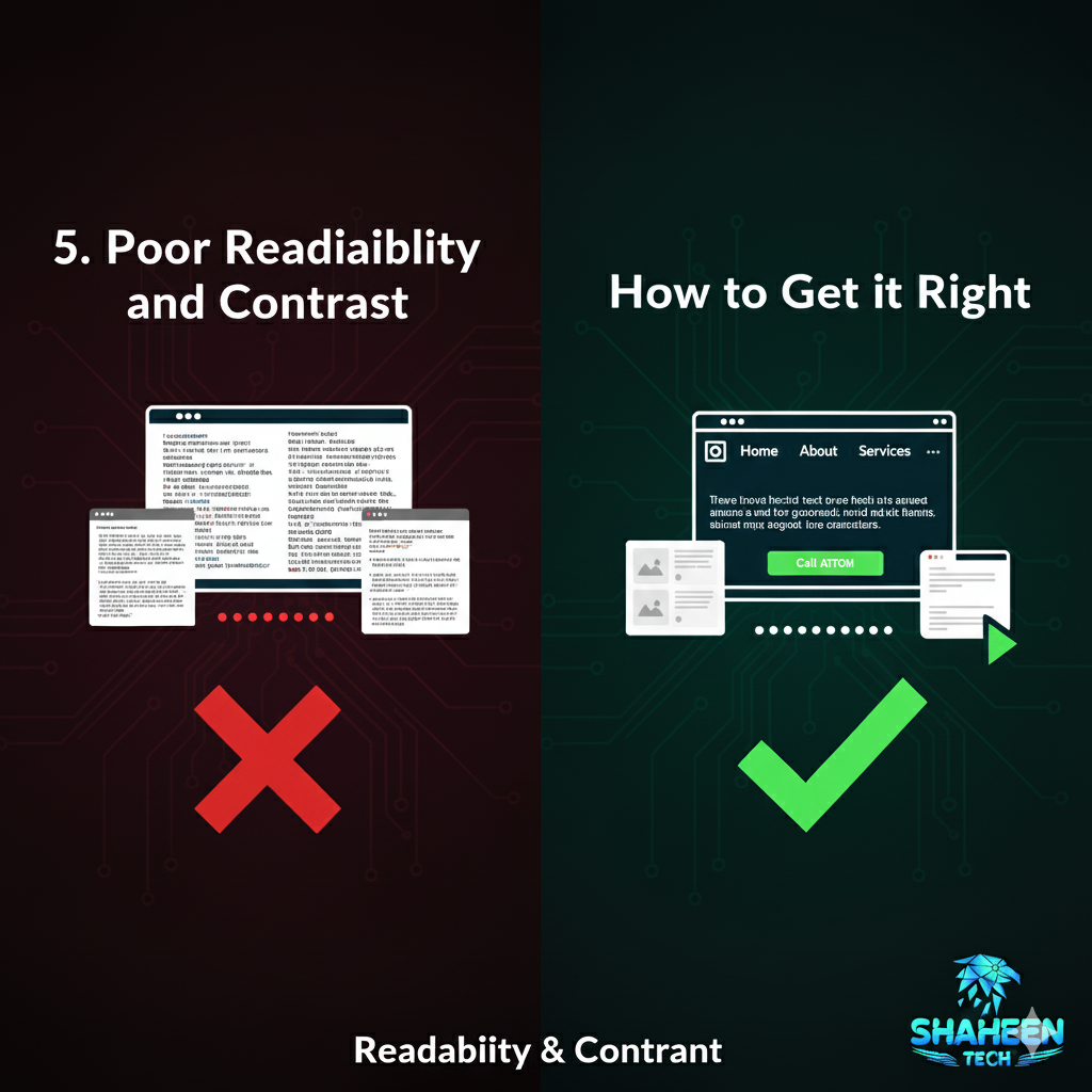
5. Poor Readability and Contrast
If your text is hard to see or decipher, you’re making your ideas work harder than they should. The combination of font choices, sizes, and colors shapes the accessibility and overall impact of your message.
To improve readability:
- Choose fonts that are legible across platforms.
- Set line heights, font sizes, and letter spacing for clear reading.
- Ensure a strong contrast between text and background.
When you follow accessibility guidelines, you support all users, including those with visual impairments. For more on accessibility, visit WebAIM’s accessibility resources.

6. Weak Calls to Action (CTAs)
A visually appealing website design means little if visitors don’t know what to do next. Vague or hard-to-find CTAs leave users guessing and miss opportunities to build relationships or make sales.
To build stronger CTAs:
- Position them where they’re easy to see without scrolling.
- Use active, engaging language (e.g., “Get Started,” “Contact Us,” “Download Now”).
- Design buttons that stand out visually but still match your branding.
When every next step is intuitive, you guide your visitors and boost results. If you need help crafting effective CTAs, explore website design services that focus on conversion optimization.

7. Overused Stock Photos
Authenticity is a key driver of trust. Overused stock images stand out and can make your brand seem impersonal or insincere. Users quickly notice when they’ve seen the same smiling office staff a dozen times across different sites.
To create a more genuine feel:
- Invest in original photography or illustrations.
- Showcase real team members and your actual workspace.
- Only use stock images when they feel unique or highly relevant.
When visuals tell your actual story, users are more likely to connect with your message.
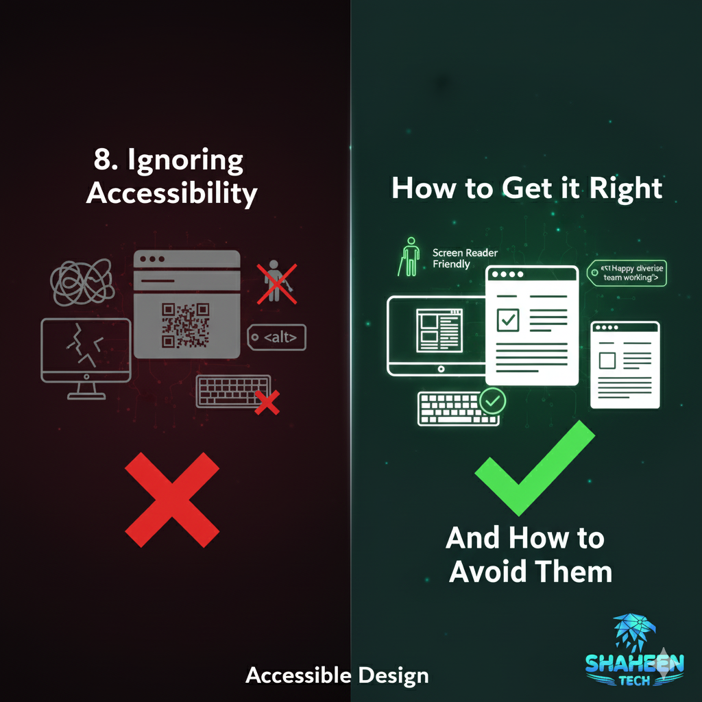
8. Ignoring Accessibility
Designing for accessibility isn’t just about compliance; it’s about respecting your entire audience. A site that excludes people with disabilities not only risks legal trouble but also leaves out millions of potential visitors.
Key steps toward an accessible site:
- Add alt text for images and proper labels for forms.
- Use semantic HTML structure for headings and lists.
- Ensure your site can be navigated using only a keyboard.
Being inclusive builds goodwill, reputation, and real community, beyond any compliance checkbox.
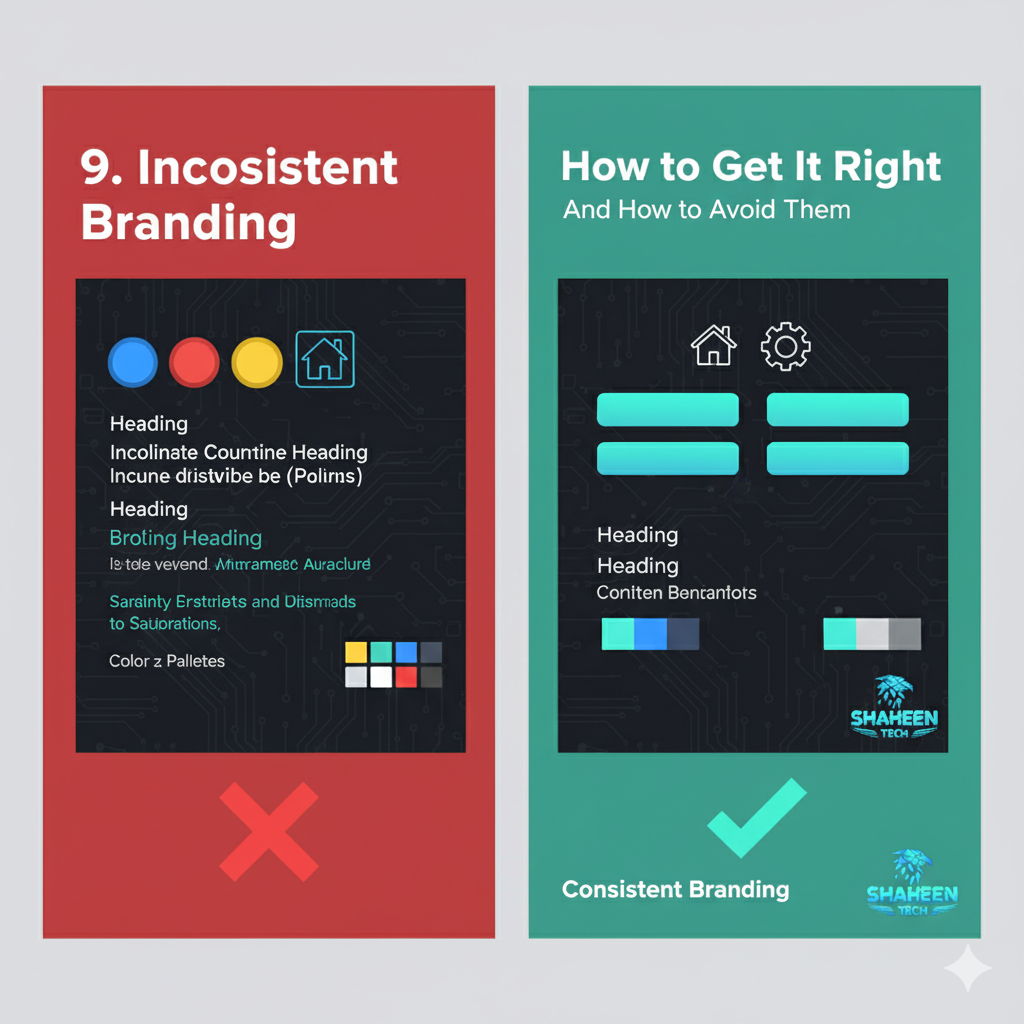
9. Inconsistent Branding
An inconsistent look and feel in your website design makes your site seem chaotic and undermines credibility. Mismatched colors, fonts, or button styles distract from your content and brand identity.
To achieve visual consistency:
| Element | Good Example | Needs Improvement |
|---|---|---|
| Color Palette | 1-3 brand colors | Random or clashing |
| Headings | Same font/size | Varied fonts/sizes |
| Buttons | Uniform style | Different shapes/sizes |
| Icons | Same family/style | Mixed icon sets |
Establishing brand guidelines and utilizing templates keeps everything tidy, efficient, and easier to scale as your site grows.

10. Not Analyzing and Iterating
Launching a site is just the beginning. Skipping ongoing analysis means you could be missing emerging problems or new opportunities. Designers who set it and forget it risk falling behind changing user expectations or technical standards.
To keep improving your site:
- Monitor user behavior with analytics tools (Google Analytics, Hotjar).
- Gather user feedback through surveys or usability testing.
- Regularly review site performance, accessibility, and SEO.
When you treat your site as a living tool that’s always getting better, user satisfaction will keep growing.

Paying attention to these factors and enhancing functionality, including effective website design, helps ensure your site doesn’t just look great, but actually works hard toward your goals. Thoughtful planning isn’t only for designers; anyone looking to connect with people online benefits from getting the basics right.
To recap, here are quick reminders on how to keep your site professional and effective:
- Design for mobile by default, incorporating best practices to enhance user experience.
- Keep things speedy and easy to explore.
- Focus on clarity; both visually and in your messaging.
- Guide visitors on what you want them to do next.
- Don’t let accessibility or consistency slip through the cracks.
- Trust the process of testing and improving.
Good website design is a habit, not a one-time project. Every small step toward avoiding these common mistakes creates a better experience for every person who visits your site. In the end, that’s where the real results begin.
If you’re ready to elevate your online presence, explore ShaheenTechX’s website design services for expert support tailored to your goals.


